Our recent high rise condo kitchen renovation swept away the browns and golds and brought in cool colors and sunshine.
Why a condo, and why renovations?
We love our home, friends, community and church in Ohio. We hate the weather in Ohio.
Naples, Florida — beautiful beaches, great weather, and lots of transplanted midwesterners. Just what we needed. We jumped in, certain that we wanted a house in a golf course community, and knowing that we did not want a high-rise condo. “We aren’t really high-rise condo people,” we told our very patient realtor. After a fun and educational week of property hunting, it turns out that we are, indeed, high-rise condo people.
We owe a very heartfelt thanks for our wonderful realtor, Terri Moellers. I can’t say enough about the importance of a great realtor. Terri was knowledgable and tireless, and patient with our ignorance and our changing wants. She also helped us to see the potential in this condo. I don’t think we would have bought it had she not been able to envision and communicate what it could become.
Our new condo had great bones and a nice layout, but was looking a bit dark and dated. It had been designed twenty years ago, and captured the passion at the time for browns and golds.

This post details our kitchen renovation, but please stay turned for posts about the master bath and great room.
The Kitchen “Before”
The kitchen was a big golden hodgepodge: honey-brown cabinets and brown granite countertops, a tan tile backsplash, black appliances, burnished brown light-fixtures, tan stone floors, honey-brown plantation shutters on the windows, golden grasscloth on the walls, and topping it all, a golden pecky cypress ceiling. No doubt this was trendy and beautiful when it was built, but it needed a little updating and freshening.

Our Style
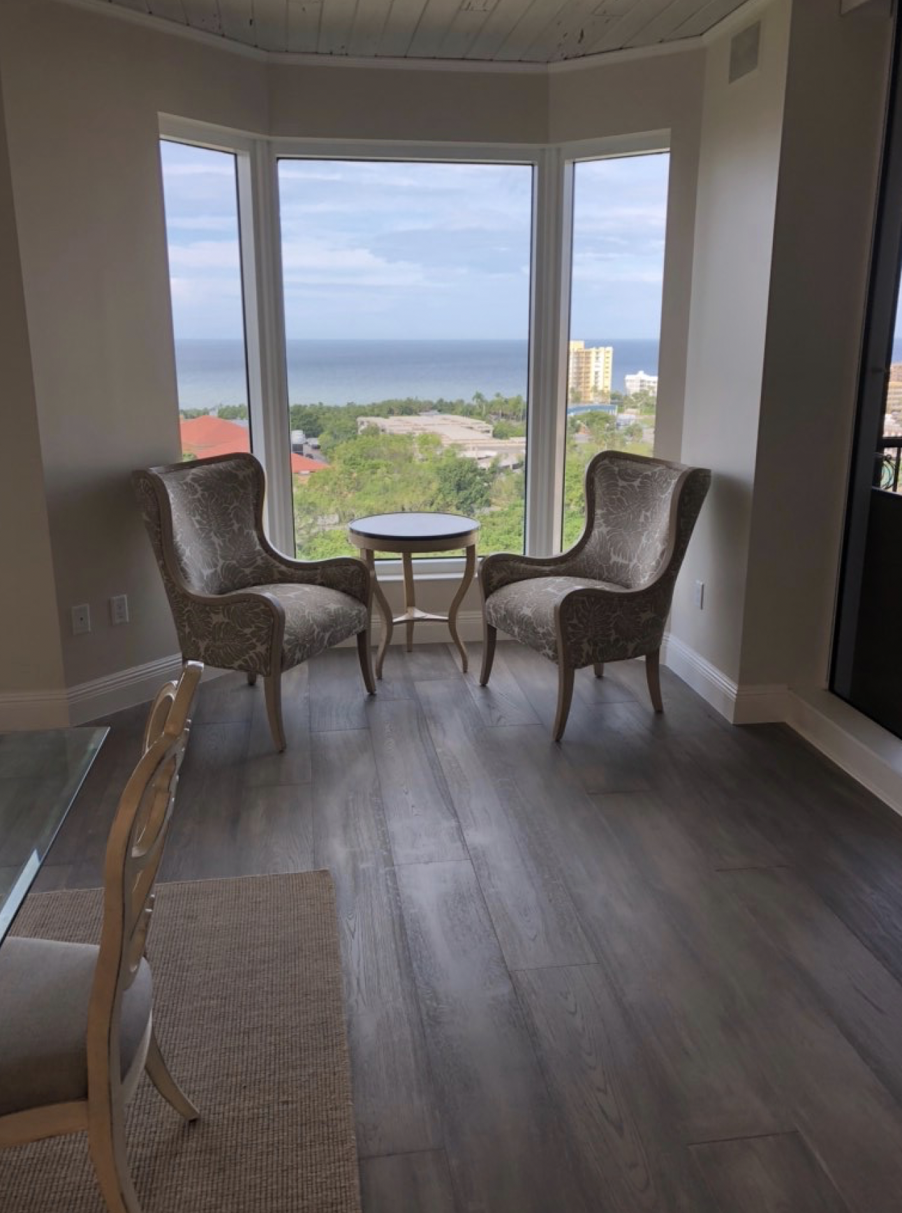
We had a vision, but not a particular “style.” In fact, I didn’t want anyone to walk in the condo and say, “Oh, it’s modern farmhouse” or“ shabby chic” or “contemporary.” But we did know what we wanted: a space that was inviting, comfortable, bright and cheerful, with a clean, casual elegance. We also wanted lots of natural light, and an emphasis on the view.
We also knew what we didn’t want. We didn’t want it to be fussy or fancy. Nothing ornate. Nothing grand, and nothing that looks like grandmother’s parlor. Out with the browns and golds; in with the whites and grays. We will want some pops of color which we will find later with art and furnishings.
Flooring
The flooring throughout the condo was a tan natural stone — pretty, but we wanted to get away from those tones. Also, stone felt cold and fancy.

Natural hardwood in grays set the tone for what we were trying to create. We chose Naturally Aged Flooring Premier Collection oak hardwood in SeaFoam, 9.5 inch.

The flooring drove all the other design choices. We were guided in our choices and the technical requirements by our contractor, Dustin Poore of REP Construction in Naples. He was terrific: knowledgeable, professional, fair, honest, and a great guy and fun to work with. We also had help for our design decisions from Lisa Lovetto of lovettodesign .
Appliances
The condo had one oven and a convection microwave.

I need two ovens, to cook multiple dishes at varying temperatures at the same time, so we decided to replace the oven and microwave with a double oven. The double-oven would be larger than the previous configuration of oven and microwave, so that would require some re-working of the cabinets. We also replaced the electric cooktop with an induction cooktop.
Cabinets
We wanted white cabinets, and we chose the Sherwin Williams color Alabaster.
Countertops, sink and plumbing fixtures
The original kitchen had a split countertop at the bar area, creating a bi-level bar-height counter.

We leveled the counter to have more working space and to create a feeling of openness..

We chose Calcutta Gold marble (which doesn’t look gold to me) for our countertops and backsplash.

That Golden Pecky Cypress Ceiling
People loved that ceiling or hated it. I almost refused to look at this condo when we were real estate shopping because I was so put off by the ceiling. It added a heaviness and darkness to the room.

Luckily, my husband saw the potential of this ceiling. It is made from an indigenous wood, and has knots and holes and imperfections. We had the ceiling painted with a white-wash so you can still see the character of the wood. I love it now!
No More Shutters — Let the Sunshine In!
The dining area had beautiful plantation shutters. I love plantation shutters. Initially we thought we would paint them white, to match the cabinets.

But then we pulled them open all the way, and we were stunned by how much more dramatic the view is without any window treatments at all. Out went the shutters.

We did install silhouette shades for when the sun is too much.
The Finished Product
We are over-the-moon thrilled! It is exactly what we envisioned, even though we couldn’t put a name on what we were looking for.


We can’t wait to have our morning coffee in this kitchen!
For more on kitchen renovations, please see Non-Invasive Facelift for the Kitchen and Family Room


2 comments
It looks amazing Laura!!! Looks like a different condo! Great job! 👍
Awesome renovation. You must have a handy “dandy” lion husband! Where can one buy that coffee cup?